

The Colour Philosophy: Why RYZ Chooses Restraint
Colour is the first thing you notice about a garment and the last thing most brands think about. At RYZ, it is the other way around. The palette is not a mood board — it is a decision, made the same way we decide on a seam or a stretch ratio. Here is why our colours are quiet, and why that is the point.
01 — The Case for Restraint
A colour is a promise about how long a piece will last
Most activewear is coloured to sell on a shelf. A high-saturation bright photographs well under studio lights, jumps out in a thumbnail, and moves product for a season. Then the season turns, the shade dates, and the piece quietly retires to the back of a drawer — not because it wore out, but because it stopped feeling current. That is a colour doing its job for the brand and against the wearer.
RYZ works to a different brief. We design for a woman who buys less and wears it longer, so the colour has to earn its place over years, not weeks. That rules out the loud and the trend-led almost immediately. What remains is a narrower, more deliberate range: warm neutrals, muted earth tones, deep considered darks, and soft, desaturated pastels. Colours that looked composed last year and will look composed next year. Restraint, in a palette, is simply respect for how long you intend to keep something.
The loudest colour in the room is rarely the one you reach for twice.
02 — The Palette, in Families
Four families, one tonal world
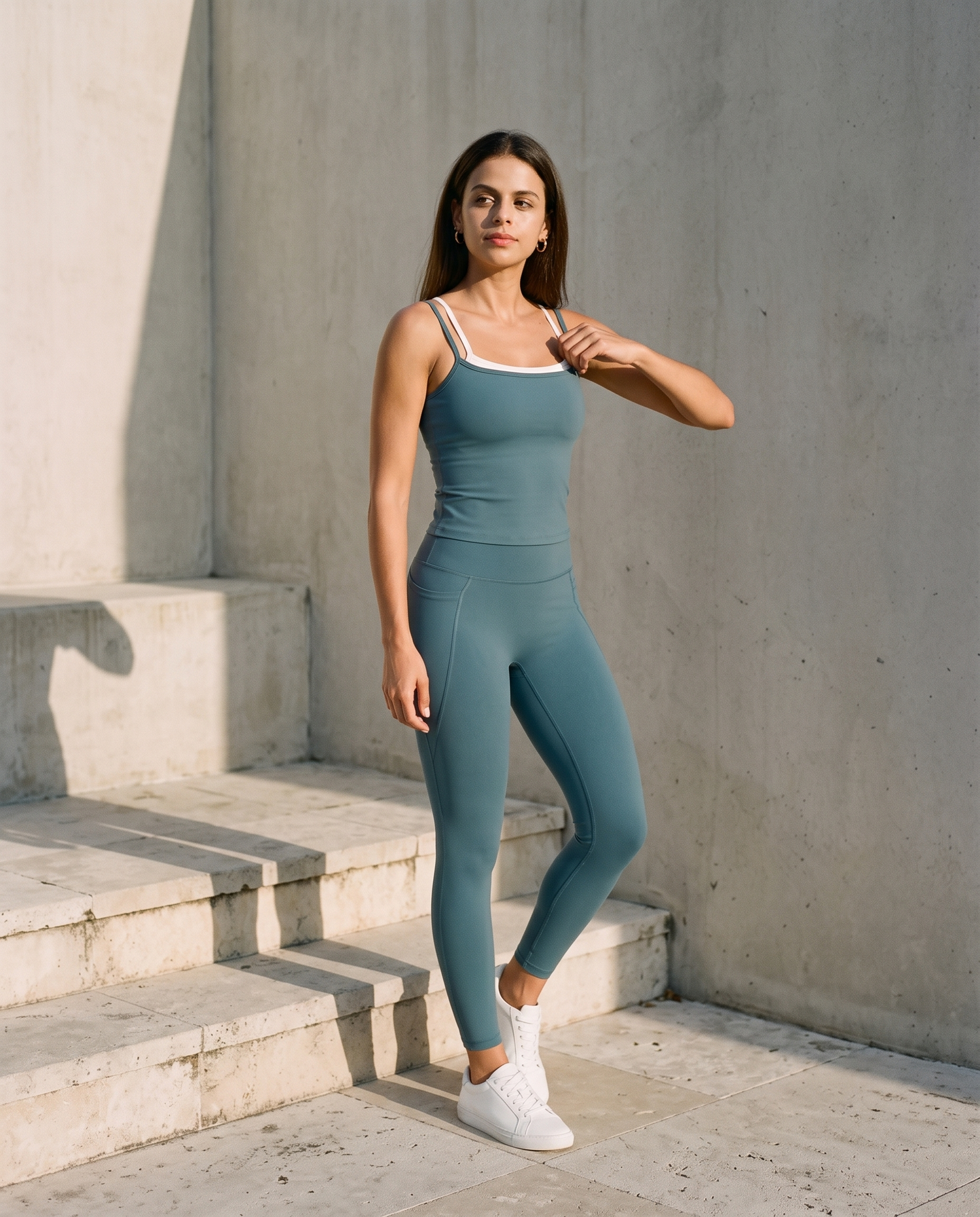
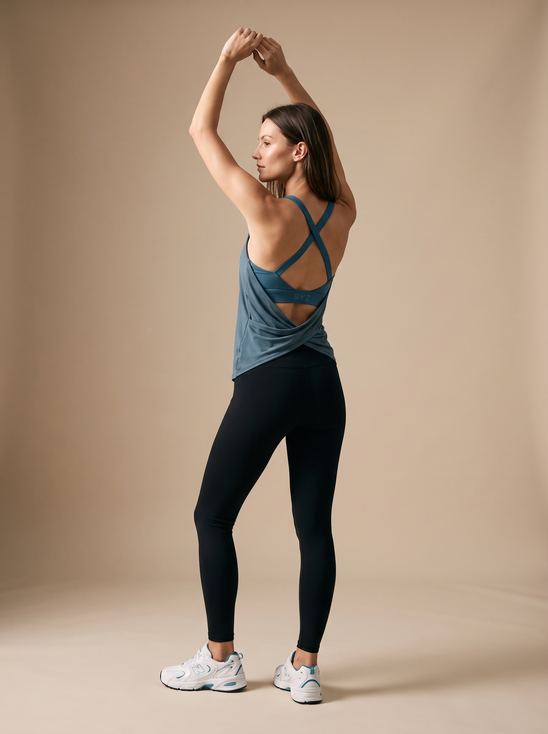
Look across the RYZ range and the colours are not random — they belong to the same family. Ivory and chocolate anchor the warm neutrals. Olive and sage carry the muted earth. Blush, coral and sky hold the soft-pastel end, desaturated so they read as elegant rather than sweet. And teal, wine, slate grey, steel and a softened black do the work of the deep tones. Every shade is chosen to sit tonally beside the others, which is why a RYZ top and a RYZ legging bought months apart still look like they were meant to be worn together.

A warm neutral like this brown is a foundation shade — it partners with almost everything else in the range.
03 — How a Colour Earns Its Place
Four tests every shade has to pass
Does it flatter in daylight, not just on screen?
A colour has to work where the wearer actually lives — a Mumbai morning, a Delhi studio, natural Indian light — not only under the controlled lighting of a product shoot. We weight the palette toward tones that read warm and true against a wide range of Indian complexions.
Will it still look considered in two years?
If a shade is tied to a single season’s trend, it fails. We choose colours with longevity built in — the kind that age like a good coat rather than a fast-fashion print.
Does it belong to the family?
A new colour has to sit beside the existing range without breaking it. If it cannot be worn with what we already make, it does not join the palette, however beautiful it is on its own.
Can it leave the gym?
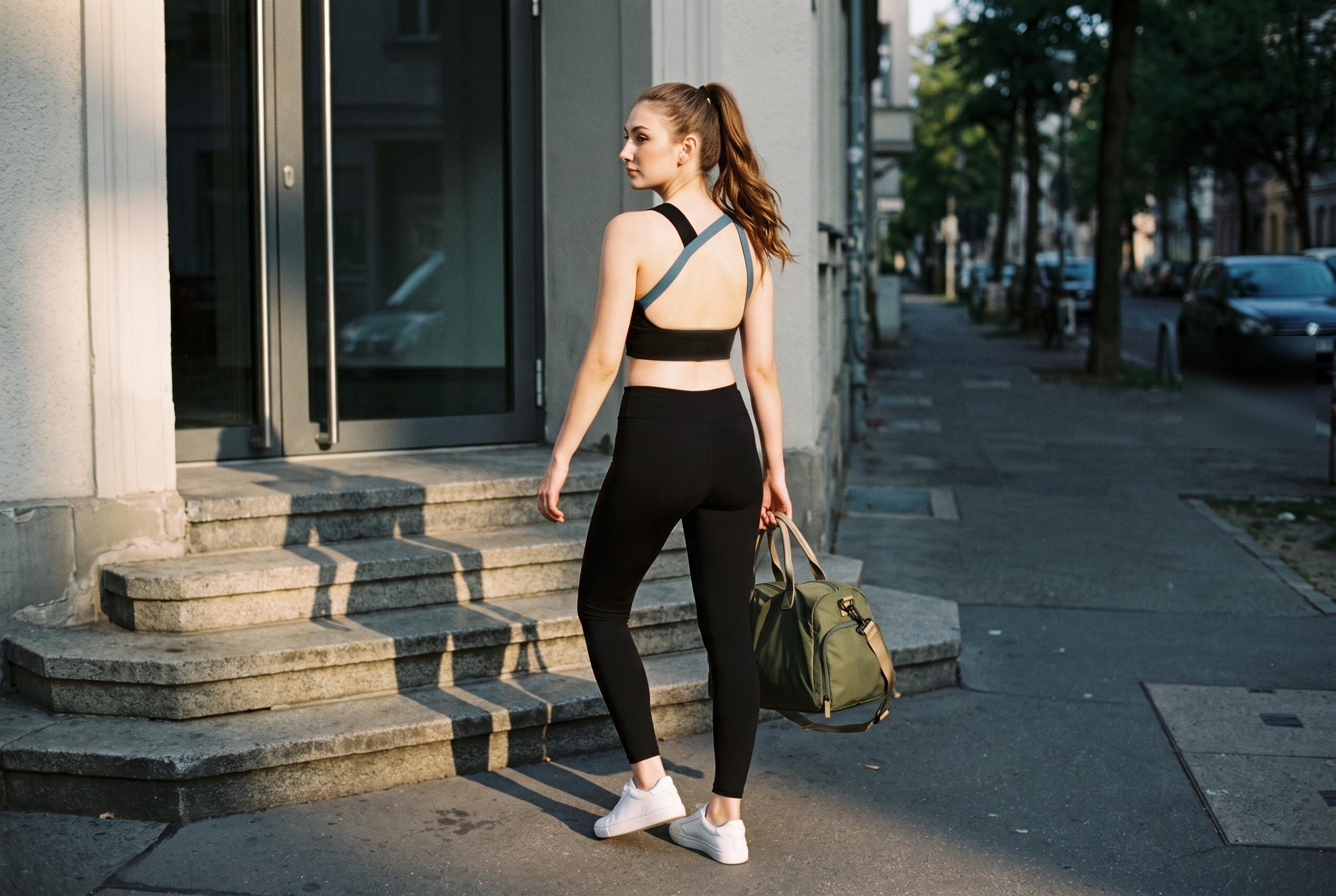
RYZ pieces are engineered to move from a workout into the rest of the day. A colour that only makes sense inside a studio has already failed the wearer. The shade has to look at home over coffee, on a commute, under a jacket.
The Quiet Advantage
Muted tones are not only a style choice — they are a practical one. Deep, desaturated colours mask the sheen of sweat more gracefully than brights, hold their depth through repeated washing, and forgive the ordinary wear of a garment that actually gets used. A considered colour is easier to live in.
04 — Colour as Engineering
The shade is only as good as the fabric holding it
A colour philosophy means nothing if the colour fades. This is where the palette meets the fabric. RYZ builds almost everything in Softretch®, our proprietary blend engineered to balance softness and stretch — and the dye has to perform against that same standard. A shade is developed to hold its depth through wash cycles, to stay even across a four-way stretch, and to look consistent from the first wear to the fiftieth. Consistency across restocks is part of this too: because the palette is narrow and controlled, a piece you buy this season is dyed to sit tonally alongside one you buy next season.
That is what we mean when we say colour is engineered, not decorated. It is chosen, tested, and held to a standard — the same as any other part of the garment.
| The Decision | Conventional Activewear | The RYZ Approach |
|---|---|---|
| Why the colour exists | To stand out on a shelf | To last in a wardrobe |
| Saturation | High, trend-led, seasonal | Muted, tonal, enduring |
| Optimised for | Studio lighting, thumbnails | Natural daylight, real skin tones |
| Range logic | Many unrelated brights | One tonal family that mixes |
| Where it belongs | The gym | The gym, and everywhere after it |
05 — Building With It
How to build a wardrobe from a quiet palette
The advantage of a considered palette is that it does the styling work for you. Start with a foundation — a warm neutral like chocolate, or a deep tone like slate grey, teal or a softened black. Add a second piece in the same tonal world and it will simply work; there is no clash to manage. Then, when you want it, bring in a soft pastel — blush, coral, sky — as an accent rather than a statement. Because nothing in the range is fighting for attention, everything cooperates. That is the difference between a collection of separates and a wardrobe.
Frequently Asked Questions
Why doesn’t RYZ do bright neon activewear?
Neon is a seasonal colour — loud on the rack, dated within a year, and difficult to wear beyond the gym. RYZ builds its palette from muted, tonal colours that hold their depth wash after wash, flatter a wide range of Indian skin tones, and integrate into a real wardrobe rather than shouting from it.
Do RYZ colours suit Indian skin tones?
Yes. The palette is deliberately weighted toward warm neutrals, muted earth tones and soft, desaturated pastels — families that read well against warm and deep Indian complexions in natural daylight, rather than the cool, high-saturation brights engineered for studio lighting.
Are RYZ colours consistent across restocks?
Consistency is a design requirement, not an accident. Because the palette is intentionally narrow, each shade is dyed to a controlled standard so a piece bought this season sits tonally alongside one bought next season — the point of a considered palette is that it keeps working together over time.
Which RYZ colours are easiest to build a wardrobe around?
Start with a warm neutral or a deep muted tone — think chocolate, slate grey, black or teal — as your foundation, then layer a soft pastel like blush, coral or sky as an accent. Because every RYZ shade is chosen to sit within the same tonal world, almost any two pieces will move together.
See the Palette in Person
Colours chosen to be worn together, and worn for years.
Continue Reading
A brand’s colours tell you what it thinks of your time. Ours are chosen to still be worth wearing long after the season that made them has passed.


Leave a comment
This site is protected by hCaptcha and the hCaptcha Privacy Policy and Terms of Service apply.